

ONE ROOM CHALLENGE™ WEEK 5: Additional pretty elements
As we start off week 5 of the One Room Challenge™ almost all of the pretty has arrived and is waiting to be installed. If you are a new reader, you can read our previous posts here:
If you are new to what the One Room Challenge™ is, it is an event for the design community. The ORC™ is currently in its thirteenth season, and this challenge is a widely anticipated biannual event every April and October. Every Wednesday, the designers document their process while sharing their sources and professional advice over the eight weekly posts. You can see all of the participants here.

This spring, Apartment Therapy is the official media sponsor as well!
ADDITIONAL Elements
Last week, I shared all of our pretty plumbing that is going to be installed. This week, I’ve been away finishing up our Denver project so I haven’t been able to see any of the progress so…. I’d like to share some of the other pretty elements.
WALLPAPER
The Mister and I have been seriously considering downsizing and as such, we have been viewing many new build homes/condos in our area. In almost every show home, there has been wallpaper. I have been quietly keeping track to his reaction and surprisingly, he has loved what he has seen.
Scott Living Mahi
We already have some wallpaper in our home. This is our mudroom.
As such, when I was working on the design of our ensuite and was showing him some 3D renderings I created, I always had wallpaper on the walls. There was no push back so I knew it was full steam ahead!
While I haven’t shared our tile yet (that is coming up next week), I had a number of choices that would work well with all of the elements in our space. Listed below are three options that I was looking at in no particular order.
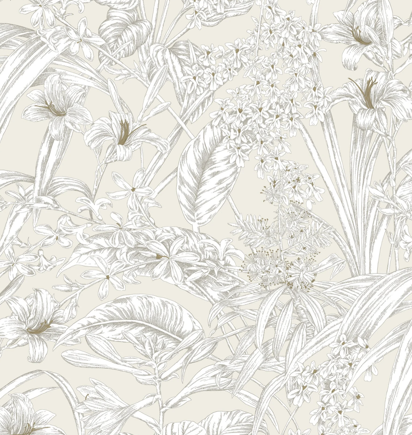
Option 1 - York Orchid Conservatory Toile Wallpaper
This wallpaper works beautifully with the tile selections and would look great with soft, gold fixtures.

Option 2 - York Handpainted Songbird Wallpaper
This option still works beautifully with the tile selections and would look so sharp with black fixtures or chrome fixtures.

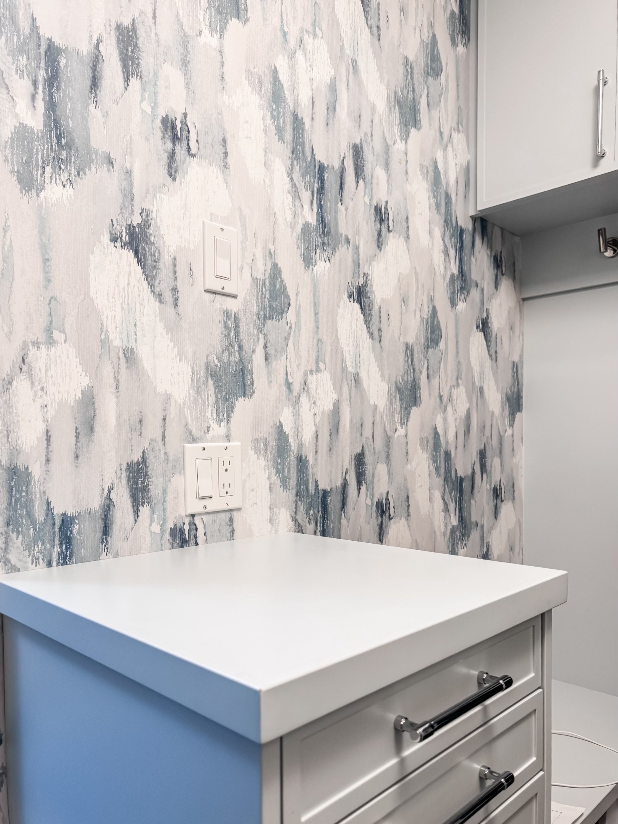
Option 3 - York Luminous Branches (Silver)
The sliver paper works very well with the tile and would look very sharp with Polished Nickel or Polished Chrome fixtures.
While it’s so nice to see the wallpaper in person, when you get to show it in a 3D rendering, to scale, you truly get a sense as to the repeat of the pattern.
The Mister doesn’t have too many requests with my designs however there was an absolute ‘NO ’ for items in our space. And that, ladies and gentleman, was gold. He does not want to see one stitch of gold of any sort. No gold lights, no gold fixtures, no gold anywhere.
Humph….all of my 3D renderings were using Kohler’s soft Vibrant French Gold. Needless to say, Option 1 was going to be out. That left me with Option 2 and Option 3.
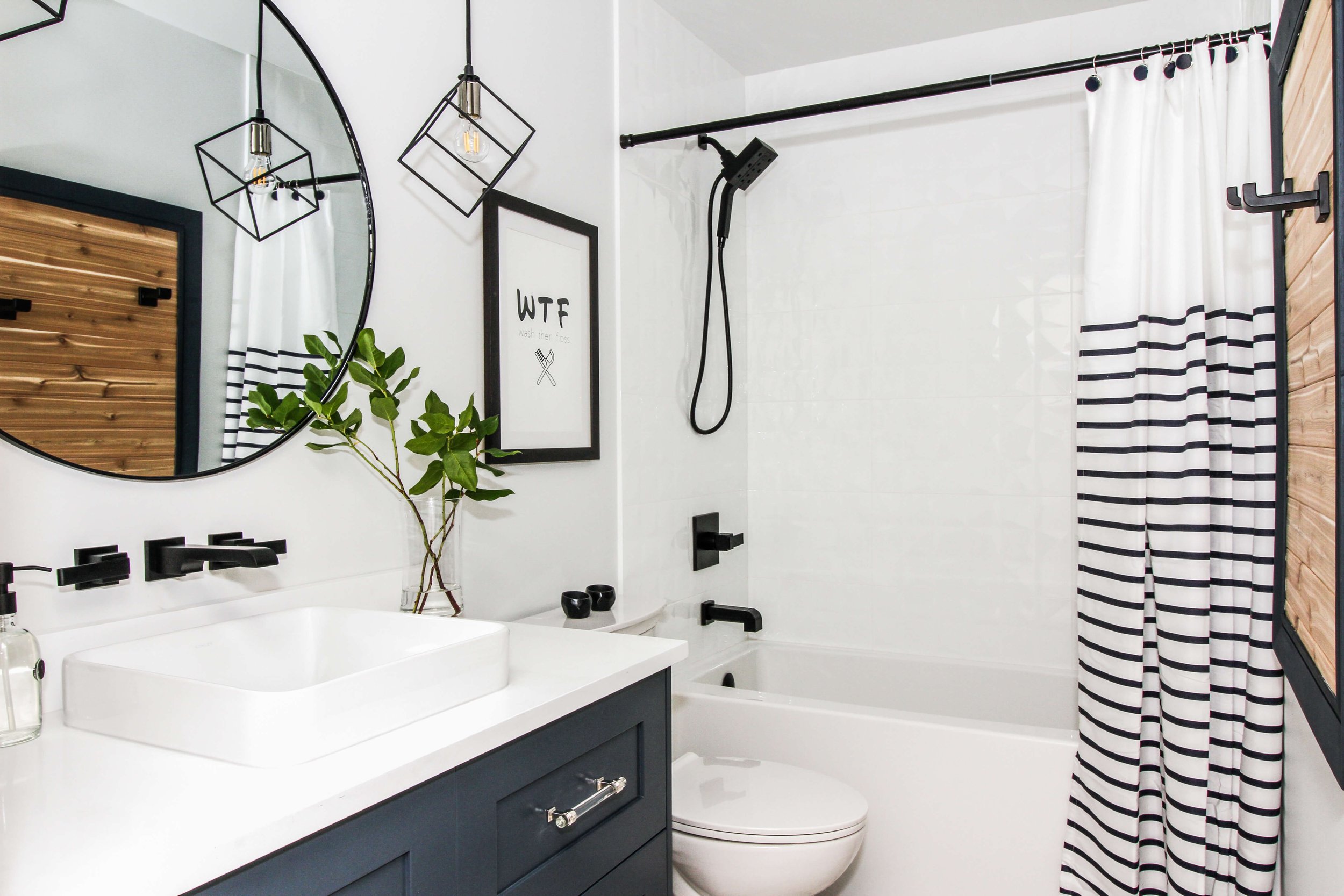
Option 2 looks really great with black fixtures. It looks ‘ok’ with chrome or polished nickel, but it REALLY looks good with black fixtures.
We already have some black fixtures in our home including our main bathroom that I completed for a past One Room Challenge™.
Past One Room Challenge™
This is our main bathroom that was completed a number of years ago.
In the end, we selected Option 3 to go with all of the other pretty elements in our space.
CABINET HARDWARE & Vanity
In making that decision to go with the silver wallpaper, that led to selecting all of our plumbing in chrome as well as all of our cabinet hardware.
I also chose Benjamin Moore’s Van Courtland Blue HC-145 for our vanity colour.

Vanity colour and style/finish for the cabinet hardware.
Next week, I’ll be sharing the tile selections and the lighting that we have made and how the entire space has come together with all of the elements. I hope you join me.
We are regularly posting on our Instagram page and stories with our project as well if you wish to follow us there.